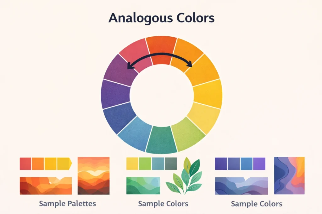
In art, “analogous” refers to colors that are next to each other on the color wheel, creating a harmonious and cohesive look.
These colors share similar hues and undertones, making them visually pleasing when used together in paintings, designs, or digital artwork.
Color is one of the most powerful tools in art. It sets mood, emphasizes elements, and guides the viewer’s eye. Among the many color schemes, analogous colors are widely used because they create harmony, unity, and a subtle visual flow.
Unlike complementary colors, which contrast strongly, analogous colors are gentle on the eyes. They are perfect for:
- Landscapes and nature-inspired art
- Interior and graphic design
- Mood-driven illustrations
- Branding and advertising visuals
Artists use analogous colors to evoke feelings of calmness, warmth, or serenity depending on the selected hues.
Understanding analogous colors is essential for artists, designers, and creatives who want to craft balanced, aesthetically appealing compositions without harsh contrasts.
Origin and Concept of Analogous Colors
The concept of analogous colors comes from color theory, which dates back to Isaac Newton’s color wheel in the 17th century. The color wheel organizes colors by hue and relationships, allowing artists to select harmonious combinations.
Analogous colors are defined as three or more colors that sit next to each other on the color wheel, such as:
- Blue, blue-green, green
- Red, red-orange, orange
- Yellow, yellow-green, green
These colors are visually compatible because they share similar undertones, making transitions between them smooth and natural.
Meaning and Usage of Analogous in Art
In art, “analogous” is used to describe color schemes and the relationship between hues in a composition.
Key Characteristics of Analogous Colors:
| Feature | Description | Example |
|---|---|---|
| Harmony | Colors feel naturally balanced | Using green, yellow-green, and yellow |
| Subtle contrast | Gentle visual differences | Red, red-orange, orange |
| Mood creation | Evokes emotions | Cool blues for calm, warm reds for energy |
| Easy blending | Smooth transitions in painting | Watercolor or gradient effects |
How to Use Analogous Colors in Art
- Choose a dominant color – Usually the color that occupies the largest area.
- Add a secondary color – The adjacent hue on the color wheel to complement the dominant color.
- Use an accent color – The third color adds interest without overpowering the composition.
- Experiment with tints and shades – Lightening or darkening the analogous colors creates depth.
Examples of Analogous Color Schemes
Here are some common analogous color schemes with context:
| Dominant Color | Secondary Color | Accent Color | Mood/Use |
|---|---|---|---|
| Blue | Blue-green | Green | Calm, serene landscapes |
| Red | Red-orange | Orange | Warmth, energy, sunset scenes |
| Yellow | Yellow-green | Green | Freshness, nature, spring themes |
| Purple | Red-purple | Red | Dramatic, romantic, or mystical tones |
Tip for digital artists: Use the color wheel tool in software like Photoshop, Illustrator, or Procreate to select harmonious analogous colors quickly.
Comparison With Other Color Schemes
Analogous colors are just one type of color harmony. Here’s how they compare with other schemes:
| Scheme | Description | Difference From Analogous |
|---|---|---|
| Complementary | Colors opposite each other on the color wheel | Creates high contrast, bold visuals |
| Triadic | Three colors evenly spaced on the color wheel | Balanced, colorful, more vibrant than analogous |
| Monochromatic | Variations of a single hue | Less dynamic than analogous, more uniform |
| Split-complementary | Base color + two adjacent to its complement | Combines contrast and harmony, more complex than analogous |
Pro tip: Analogous schemes are ideal when you want harmony, while complementary schemes are better for contrast.
Practical Applications of Analogous Colors
Analogous colors are used in multiple artistic and design fields:
- Painting: Landscapes, abstract art, and portraits
- Interior design: Walls, furniture, and decor for cohesive rooms
- Graphic design: Posters, branding, websites for pleasing visuals
- Fashion: Clothing combinations for stylish outfits
- Photography: Color grading for cohesive visual storytelling
Common Mistakes When Using Analogous Colors
- Using too many similar colors, causing the composition to appear flat
- Ignoring contrast for focal points – some accent color is necessary
- Not adjusting tints and shades to create depth
- Overcomplicating the palette – simple three-color schemes are often most effective
FAQs
- What does analogous mean in art?
It refers to colors next to each other on the color wheel that create harmony. - How many colors are in an analogous color scheme?
Typically three, but sometimes 2–5 colors can be used. - Is analogous color scheme warm or cool?
It can be either; it depends on the dominant color chosen. - Can you use analogous colors in digital art?
Yes, and it’s very common for creating pleasing, professional-looking designs. - What is the difference between analogous and complementary colors?
Analogous are next to each other on the color wheel (harmonious), complementary are opposite (high contrast). - Why are analogous colors used in nature scenes?
Because natural landscapes often contain colors that blend harmoniously, like greens and yellows. - Can analogous colors be used for mood?
Yes, they are excellent for evoking calmness, warmth, or serenity. - Do analogous colors work in fashion design?
Absolutely. They create visually appealing outfits without harsh contrast.
Practical Tips for Artists Using Analogous Colors
- Start with a dominant color and build the scheme around it
- Use different shades and tints to add depth
- Include a small accent color for emphasis
- Study nature and photography for inspiration – many natural scenes use analogous colors
- Practice creating gradients and transitions using these colors
Conclusion
Analogous colors are a foundational concept in art and design that help create harmony, balance, and visual appeal. By understanding and using them effectively, artists and designers can craft compositions that feel natural and aesthetically pleasing.
- Pro tip: Use one dominant color, a secondary color, and a small accent color for maximum impact.
- Practice tip: Experiment with shades, tints, and natural references to perfect your analogous color schemes.
Mastering analogous colors will improve your color harmony skills, making your artwork more cohesive and visually engaging.
Discover More Related Articles:
- Perseverance Mean in the Bible: Lessons from Paul, Job, and Jesus for 2026
- Subdue Meaning in the Bible: Lessons for 2026

Madison Taylor is an experienced content writer who focuses on researching and explaining word meanings, slang, and texting terms. She writes for meanvoro.com, creating clear and accurate to help readers understand language easily.